If you’ve been following my blog, I taught as a Professor of Art and Design for a decade prior to taking my sabbatical and coming to Israel to pick up the MA in Holocaust Ed at the University of Haifa. I’ve had nightmares about the Shoah since the age of 13. My faculty art exhibitions showcase what I see in my nightmares. This post reflects and highlights pieces from my Design portfolio that I’ve created in the past 2 years while studying at the University of Haifa.
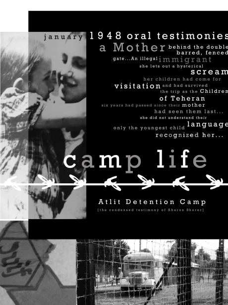
The first piece I designed while attending the program was for the Atlit Detention Center, located a few miles outside of Haifa. My Practical Curating Course met at the center during the Fall Semester of 2015. I was assigned the testimony of a man by the name of Aharon Shorer. I didn’t have any photographs of him, and none were found on record at the Detention Center. I selected specific photos from the photography shoots that I did of the camp throughout the semester, combined with the Rockwell Font. The barbed wire on the poster was also created from typographic elements.


Hanukkah was shortly approaching as I finished the poster for the Atlit Detention Center. Each year I design a new creation for the Festival of Lights. I chose the Shema prayer for personal reasons. My Rabbi introduced me to reading the Shema prayer about 4 years ago. It helped combat my Holocaust Nightmares. The poster is quite large–approximately 30 x 40 inches. The images above show a close-up view of the poster, and an overall view of it in its entirety.
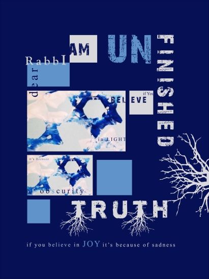
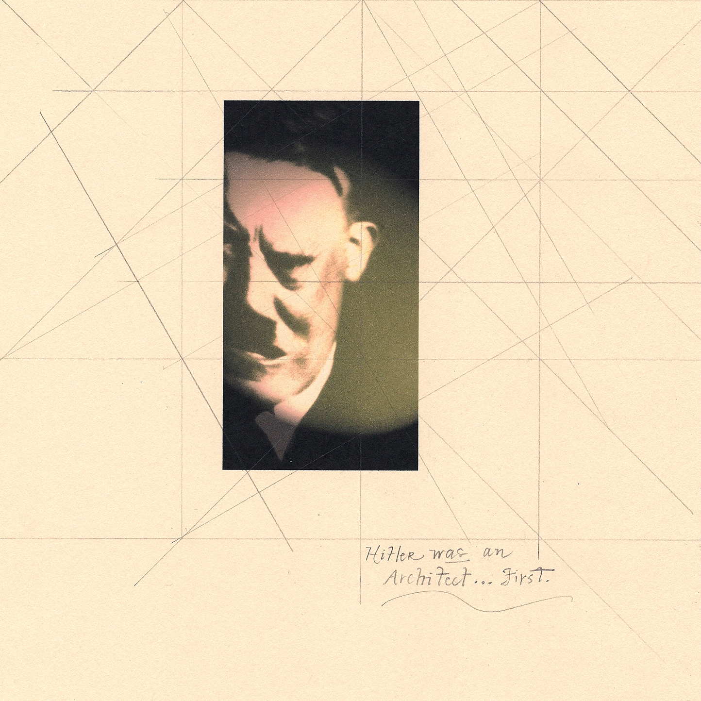
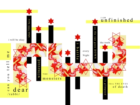
In the summer of 2016, I opted to move out of the Uhaifa dorms and to Tsfat–where my Rabbi resides with his family. A few weeks into my arrival in Tsfat, I started to have Holocaust Nightmares again. This time–my Rabbi appeared in them also. Our conversations begin as we are awaiting deportation for the concentration camp. I embarked on a new design series which I called “UNFINISHED.” This was the first poster I designed in the series.
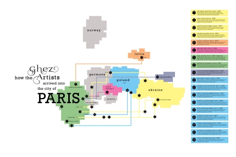
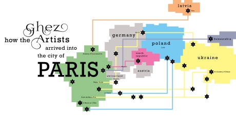
My 2016 Fall Semester at Uhaifa began in a design frenzy. I had multiple projects going at once. First, was the creation of the Routing System Posters for the Ghez Collection of Jewish Artists for the Hecht Museum. While this exhibition never made it to the public’s eye due to a limited budget, I was kept very busy until the end of the semester creating the routing system posters for my Curating Class. I really enjoyed researching that era in history, along with the popular fonts being used in way-finding design.
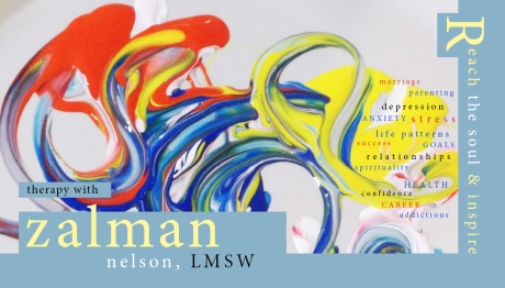
The second project I tackled was a complete marketing package for my Rabbi’s Therapy practice. I began by creating his business card…Not an easy task. Designing for a therapist has been one of my largest design challenges. How does one create mood and emotions? I made three attempts at his business card. Finally, I decided to smear some paint around on a paper plate and take a picture. The rest is history. Everything else fell into place.
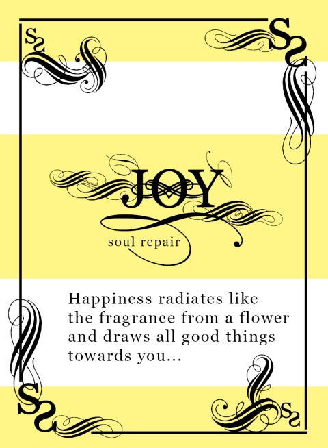
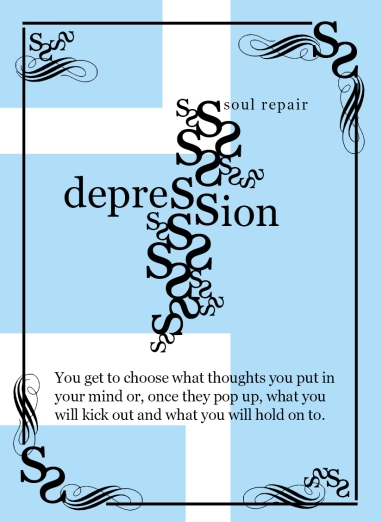
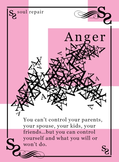
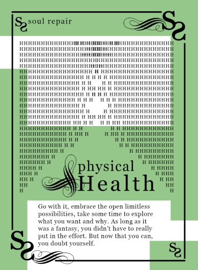
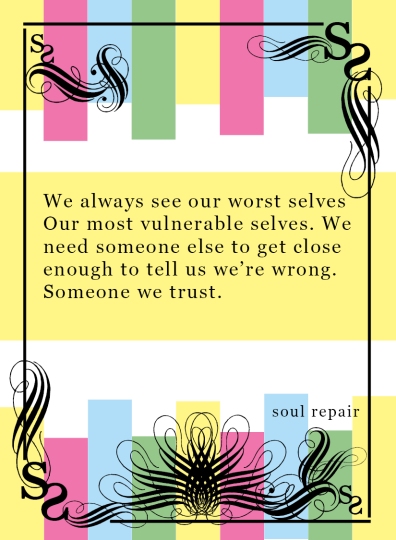
The next area of his marketing campaign required me to design a set of Soul Repair Therapy Cards. They are used on his Facebook Therapy page as quotes for the day. I decided to break down the set into different colors/ moods. YELLOW is JOY. BLUE is DEPRESSION. RED is ANGER. GREEN is PHYSICAL HEALTH, and the RAINBOW colored card represents multiple moods/ categories.
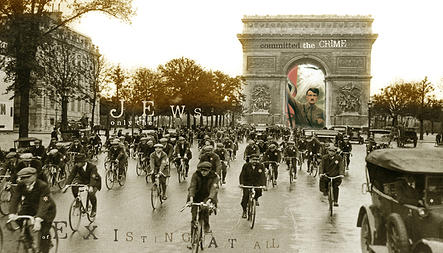
My Holocaust nightmares continued that fall, and I kept designing new posters and adding to my UNFINISHED series. As one nightmare ended, a new one would begin and take off where the previous one had dissolved. This was a new phase in my nightmares–almost like a soap opera of continuation:
Winter came and settled across Israel. Heavy rains, fog, and snow were welcomed in Tsfat. By now I was familiar with the Old City, and my many favorite walking paths held new inspiration of wonder. With camera in hand, I captured the beautiful creations of nature and the songs that could be heard through a winter’s night. I created 2 postcards during my holiday break:
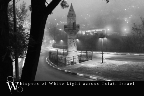
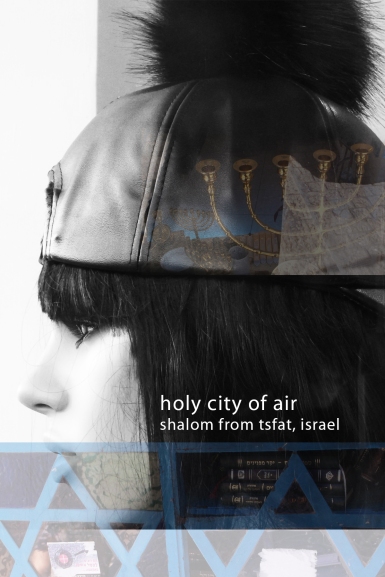
“Whispers of White Light across Tsfat, Israel” was photographed in a heavy rain storm with fog rumbling in through the hills. The second postcard showcases my fascination with all of the mannequins found on Jerusalem street in the Old City:
I decided it was time to do a major over-haul to my Graphic Design and Photography website online. I trashed my old site, and began building a new one from scratch. I had so many photos of the sites I had toured across Israel, combined with my work as a Designer–that it was simply time for a new one.
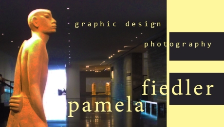
https://enigma3304.wixsite.com/pamelafiedler
During this time, I was also in construction on the new Therapy website for my Rabbi. His business card was done, the Soul Repair Therapy cards were a success, and the website was nearing completion. He was expanding his practice, and also writing a new therapy book. My job was to layout the entire body of text, combined with photos–and also design the book cover.

By the time I finished completion on “Secrets of the Tanya”— his website had been published. I was required to add an additional Tanya page to his website, along with creating a new Facebook Advertising banner.
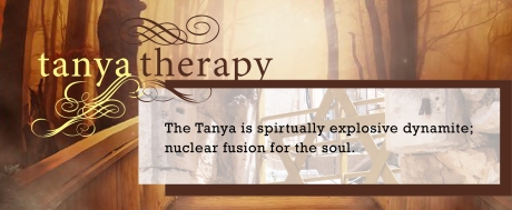
https://www.facebook.com/DoTanyaTherapy/
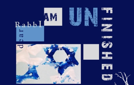
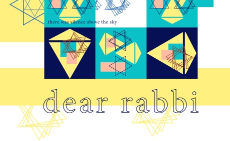
I had put aside my “UNFINISHED” series for a few months, and decided to return to it. I had so much I wanted to say. However, sometimes the words and creativity don’t always come together all at once. My third poster kept challenging me. I was never satisfied with it. I kept re-working it and creating hybrid after hybrid:

http://enigma3304.wixsite.com/ash-from-the-rose
I kept adding my work to my above website: “Holocaust Nightmares: ASH FROM THE ROSE.” It showcases my faculty exhibition artwork surrounding the Shoah, along with my photographs and book memoir.
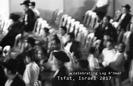
Lag B’Omer in Tsfat fills the streets with crowds of people, parades, and night time activities. Just a few miles down the road is the small town of Meron–where close to 800,000 Jews came this spring to celebrate Lag B’Omer. Many of which, stayed in Tsfat. I wanted to capture the mass of the crowd, and not focus on specific faces.
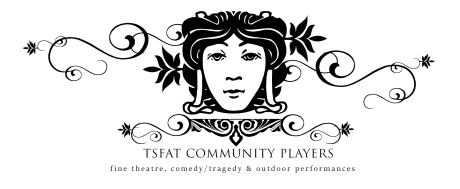
My summer has been spent working on the marketing campaign for the Tsfat Community Players. I researched the Comedy/ Tragedy masks for a couple of months. Along with, looking at many different branding campaigns that other theaters had. I decided that I didn’t want the Tsfat Theater to be represented by the classic drama masks and set out on my own design mission. I watched the movie “Shakespeare in Love” again–to get inspiration in creating the new logo for the theater. From start to finish, this design took me approximately 15 hours. Once it was complete in black ink and vector mode, it was time to look at the addition of color:
https://www.facebook.com/Tsfat-Community-Players-1365019863576271/
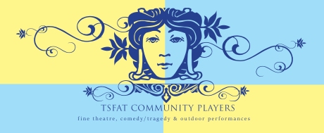
Color changes everything, doesn’t it? Now that I have the logo mastered, I had to create an advertising poster for the theater–a Call For Actors and Actresses in their next production: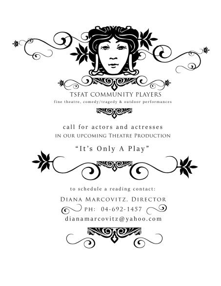
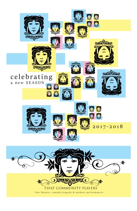
This also gave the director the opportunity to see the logo in motion, and working as the advertising and branding centerpiece. The Facebook website page was created, and I kept moving forward. The next item on the agenda was to design an advertising poster for the 2017-18 Season:
With three weeks left to go in my semester, what’s next on my design palette? I’m currently in production on creating a TSFAT: Holy City of Air travel and tourism website. I’ll be on vacation in Rome and Spain after my semester ends. I plan on creating a new business card for myself. As a designer for Holocaust Education, I don’t think I’ve always taken the easiest roads. However, sometimes the ones less traveled help pioneers who boldly go where so few are brave enough to journey…